· The SleepGrids Team · Design & Science · 9 min read
Why Your Brain Loves Seeing Sleep Data in Grids (The Psychology Explained)
Most sleep apps show you charts. Charts tell you what happened. A grid shows you why. Here's the cognitive science behind visual habit tracking — and why it changes behaviour.
Open most health apps and you’ll find a line graph. Days along the bottom, metric along the side, a squiggly line connecting the dots. It tells a simple story: you went up here, you went down there.
But here’s the thing about line graphs: they tell you what happened. They rarely help you understand why. And in the context of sleep — where the “why” is everything — a graph that strips away context in the name of simplicity leaves you with data you can observe but not act on.
This is why the visual grid format, used in sleep pattern tracking and elsewhere, represents something more than a design choice. It reflects how the human brain actually processes patterns — and why that difference in processing directly affects whether you change your behaviour or simply observe your data.
How Your Brain Processes Visual Information
Before we get to sleep specifically, it’s worth understanding the cognitive science behind visual data processing.
Psychologists distinguish between two modes of visual processing: pre-attentive and attentive. Pre-attentive processing happens automatically, before conscious thought — your visual cortex processes certain features (colour, shape, motion, orientation) in parallel, across the entire visual field, in under 250 milliseconds. Attentive processing is serial and deliberate — you consciously examine one element at a time.
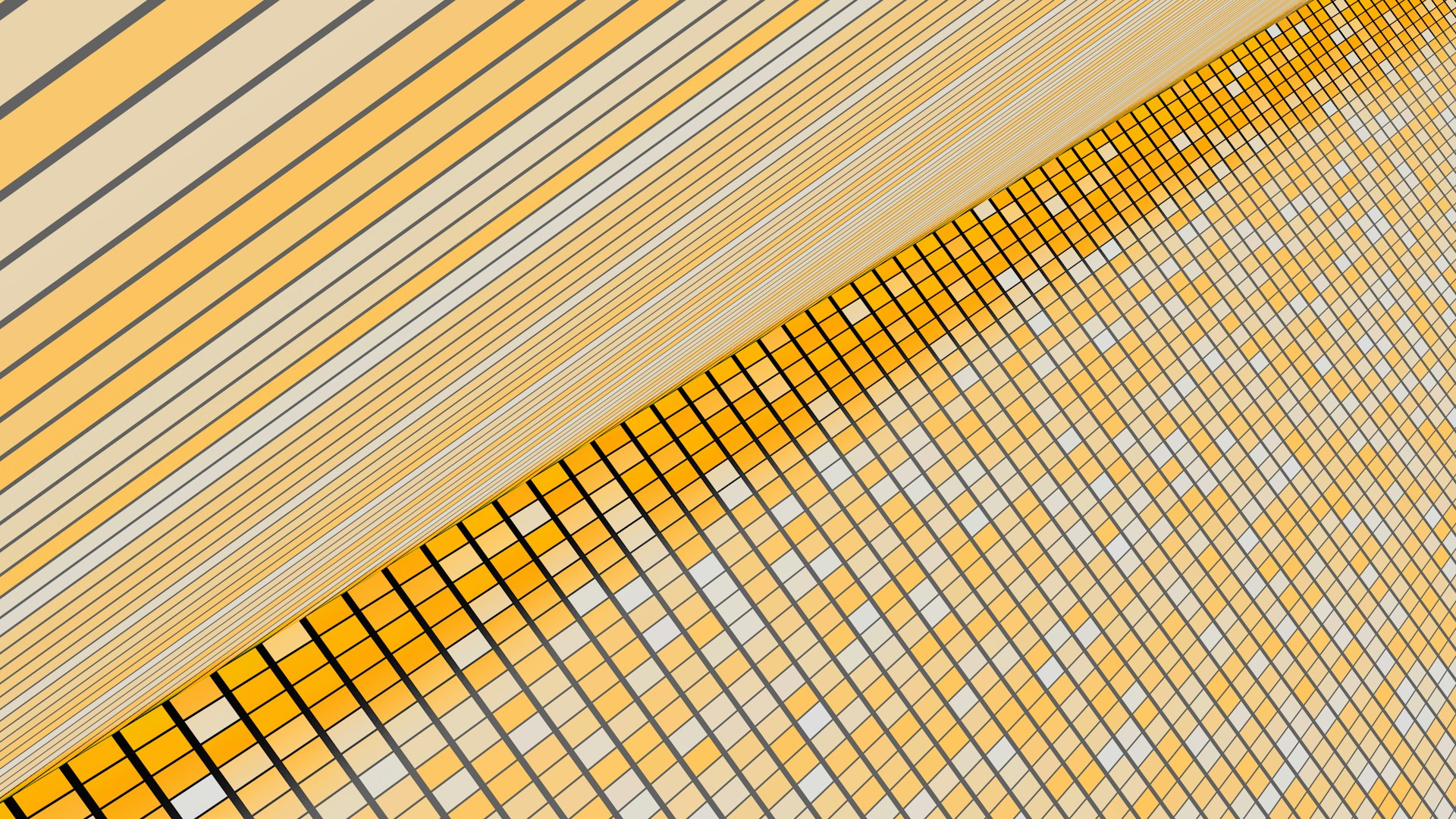
A line graph primarily engages attentive processing. You look at one data point, then another, then draw a conscious inference between them. For two or three data points, this works fine. For 30 days of sleep data with multiple variables, it produces cognitive overload before you’ve extracted anything useful.
A grid or heatmap engages pre-attentive processing. Your visual cortex processes the entire month of colour-coded data simultaneously, identifying clusters, outliers, and patterns without requiring deliberate effort. A block of red cells in the middle of a week stands out before you’ve consciously looked for it. A consistent band of green across Tuesday nights draws your eye before you’ve decided to look at Tuesday nights.
This isn’t a subtle difference. Pre-attentive pattern recognition is orders of magnitude faster and more accurate than attentive analysis for the kinds of multi-variable patterns that matter in sleep health.
Gestalt Perception and the “Big Picture”
The specific cognitive mechanism is best described through the concept of Gestalt perception, developed by German psychologists in the early 20th century and validated extensively since.
Gestalt theory holds that the brain is configured to perceive wholes rather than collections of parts. When presented with a grid of coloured tiles, you don’t consciously process 30 individual cells — you perceive a pattern, a texture, a shape. This “emergent” perception — the whole being different from the sum of its parts — allows you to extract meaning at a scale and speed that element-by-element analysis cannot match.
In practical sleep tracking terms: when you look at a month-view grid, you aren’t looking at 30 individual nights. You’re looking at a tapestry of your sleep life. And the tapestry reveals things the individual threads cannot.
You might notice a vertical column of red squares every Wednesday. Before conscious analysis, your brain has already registered this as a pattern. On examination, you realise Wednesday is the day after your Tuesday late-night work sessions. A line graph has that same information — but the visual salience of a grid makes it impossible to miss.
You might notice that the left side of every week is consistently greener than the right. Before you’ve formed a hypothesis, your brain has already registered the asymmetry. The insight — that you sleep better on weekdays than weekends — arrives faster, with less cognitive effort, and more memorably than it would from reading a table.
The “Don’t Break the Chain” Effect
Beyond pattern recognition, grids leverage a second powerful psychological mechanism: the streak.
Jerry Seinfeld, asked about his productivity method, described a simple system: put a red X on a calendar for every day you complete your target behaviour. After a few days, you have a chain. “Your only job,” he said, “is to not break the chain.”
What Seinfeld was describing, without the academic framing, is the Zeigarnik effect applied to positive streaks — the psychological pull of an unfinished sequence toward completion. When you can see three green nights in a row on your sleep grid, the desire to extend the streak becomes motivating in a way that a three-day average never could.
This works because of how the brain represents visual sequences. A row of green tiles is a coherent visual object — a chain. Breaking it means introducing a disrupting element into what is otherwise a pattern. The visual disruption costs something that the abstract “streak counter” in a conventional app doesn’t communicate with the same immediacy.
This is also why the monthly view matters more than the daily view. On any given morning, a single night’s quality is just a number. In a monthly grid, that same night is a tile in a larger tapestry — part of a pattern that the brain is wired to preserve once it’s been established.
Colour as a Cognitive Shortcut
Colour coding adds a further layer by leveraging chromatic pre-attentive processing — the fastest, most automatic form of visual pattern recognition.
When sleep quality is represented on a gradient from red (poor) to green (excellent), the emotional and cognitive associations of these colours don’t need to be learned — they are deeply embedded, likely cross-culturally, as signals: red = warning, green = good. Your brain doesn’t need to read a legend or interpret a scale. The colour communicates the meaning faster than language can.
This is more than aesthetic. Colour-coded data has been shown in research contexts to reduce cognitive load, increase information retention, and improve decision-making speed compared to equivalent data presented numerically. In a health-tracking context, it also creates an emotional dimension — the positive affect of seeing a green tile, the mild negative response to a red one — that amplifies the motivational effects of the streak mechanism described above.
The Habit Grid: Seeing Correlation Without Statistics
The real power of a sleep grid isn’t the sleep quality data alone — it’s what happens when habit data sits alongside it.
When you can see, in the same spatial frame, that your habit icons for “no alcohol” and “exercise” cluster on the same nights as your green quality tiles, your brain doesn’t need to run a correlation analysis. The spatial co-occurrence is the correlation, perceived pre-attentively and understood instantly.
This is a fundamental shift from how most health data is presented. Conventional apps might tell you: “Your sleep score is 15% higher on days you exercise.” That requires reading, interpretation, and abstract mental modelling.
A visual grid shows you: the nights with the exercise icon are consistently the nights with the green tiles. Your brain understands this before your prefrontal cortex has finished processing the sentence.
The science of sleep pattern recognition covers the broader research on why visual tracking produces the 33% improvement in behaviour change that studies consistently demonstrate. But the mechanism starts here — with a format that works with the brain’s natural pattern-detection architecture rather than against it.
Why Minimalism Matters
One final principle worth naming: a grid-based sleep tracker works best when it’s deliberately simple.
The temptation in health technology is to add complexity — more metrics, more stages, more data points. But complexity has a cognitive cost. Every additional variable you add to a display requires attentive processing to interpret, which gradually erodes the pre-attentive pattern detection advantage that makes visual data so powerful.
The most useful sleep grids track a small number of high-signal variables: sleep hours, quality rating, and the habits most likely to correlate with sleep outcomes. Tracking caffeine timing, alcohol, exercise, and a few other key habits alongside quality rating gives you a grid with genuine pattern-detection power — without the noise that buries the signal. If you’re starting out and prefer not to use a wearable device, learning how to track sleep without wearables shows how visual grids become your primary data source for manual logging.
Stop looking at numbers. Start seeing patterns. The insight you need is already in your data — but only a format built for pattern recognition can show it to you. When choosing your tracking tool, look for one that prioritizes the grid format — whether you’re using a dedicated app or one of the best free sleep log apps available for iPhone, the visual approach will serve you far better than numerical dashboards alone.
Frequently Asked Questions
Why is a grid or heatmap better than a chart for tracking sleep? A grid displays quality, duration, and habits simultaneously across weeks and months. Your brain processes this “gestalt” — the whole pattern at once — in seconds. A line graph shows what happened day-by-day; a grid shows why a whole week was poor, or which recurring pattern is costing you energy.
What is the “Don’t Break the Chain” effect in visual habit tracking? Popularised by Jerry Seinfeld, this effect describes how a visible streak of completed or positive days creates powerful psychological momentum. When you can see a growing row of green tiles, the desire to maintain the chain becomes its own motivation — especially on days when discipline alone might not be enough.
How does colour-coding improve health tracking outcomes? Colour leverages pre-attentive processing — your brain identifies red versus green tiles before conscious thought engages. This makes pattern recognition effortless and emotionally intuitive. You don’t need to interpret data; the grid communicates the story of your sleep health at a glance.
Is visual data more motivating than numbers for health habits? For most people, yes. Numbers require conscious interpretation; colours and shapes are processed intuitively and trigger emotional responses. Research in behavioural science consistently shows that visual feedback systems improve engagement, consistency, and long-term adherence compared to numerical-only logs.
How many weeks of data do I need before visual patterns become useful? Two to three weeks of consistent daily logging is enough to spot your first meaningful patterns. A full month provides a reliable baseline. Three or more months is where deeper patterns — seasonal, hormonal, or related to work cycles — begin to emerge clearly in the grid.
Download SleepGrids and build your first grid — log in 10 seconds a day and let the visual patterns tell you what your sleep data has been trying to say all along. Free to download.